Saturday, 29 December 2012

Further experimentation


M Y  O W N  I D E A S

After previously experimenting lots I was about to give up and move onto something else as I was happy with what I had produced. However, today I came home to find 4 boxes of unused fruit tea about to go in the bin and I couldn't resist the temptation of more experimenting. 
I had 4 different flavours of fruit tea available to use, these were fennel and nettle, summer berries, cinnamon and lemon and honey. 
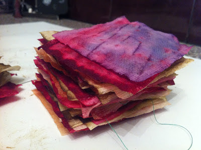
I used 4 cups of hot water (a colour per cup) and put several bags of each colour into the cups to allow the colours to be the most vibrant they possibly could. I found that the cinnamon cup and the berries cup turned the same colour and so I was left with only three colours; cerise, green and yellowy brown.  However, I accidentally dropped spilt some water onto a pink one and I found that it turned lilac as shown in the image below


I dried them thoroughly and then took the tea out of them. This same week I had ordered a book which I received and was water damaged and so I couldn't use it, this gave me the idea to fill the tea bags with the images from the book as it was going to be thrown away. 


I ended up with 54 tea bags which I was really pleased with and glad I experimented. I then stitched them all together. 
Tuesday, 11 December 2012

Collecting Data


E V E R Y D A Y  L I F E 

For the new sampling unit I found it difficult to put my finger on what I thought of as data, and then I realised that data is really everything. Everything we think and do can be considered data. From this perspective I then decided to base my project on collections of data. 
I began the unit by collecting data from everyday life. I chose to collect all of the wasted tea bags in my house each day. I did this because it was interesting to me that they are normally thrown away and I wanted to recycle them in some way. 
I had heard about tea bag waxing before but never tried it myself, and so with my collections  I started to experiment and found myself with some really pleasing outcomes. 


This waxed tea bag below was the first one I produced and I filled the inside with things I was going to throw away or little things i found. Inside this tea bag, was a long piece of thread, a cut out bit of card from the packaging of a desert and a piece of music paper from a book that my sister was throwing out. 


I experimented with random things I was going to throw away and tried this in circle and rectangle shapes. 


After much more experimentation I found what I liked and decided to produce some more samples this time with both used tea bags and unused tea bags. 


Tuesday, 13 November 2012

Combinations


P R I N T  W I T H  S T I T C H

To create this piece I firstly printed the backing linen cloth with reactive dye and manutex. I then put it in the steamer... cold water... hot soapy water...cold water... dry. Iron.
This piece was not originally meant to turn out like this, but once again I'm happy with my accident. I screen printed my mini motif onto a muslin cloth, and originally I wanted to present this piece with my muslin layered over the top of this backing fabric. In my head, I would be able to see the colours of the backing fabric through the muslin. However, after printing both pieces I could not see the backing fabric at all through the muslin. So, instead I decided to experiment with appliqué. I cut around the edge of my mini and pinned and sewed it onto my backing fabric. 

As I have previously talked about in a post before, it is interesting to consider whereabouts I could imagine this print being used. So far, I have thought of it being used on the face of a linen bag, or perhaps a repeat onto a quilt, or pillow of some kind. Even on a fashion garment, but I think it is more suited to home/soft furnishings. 

Another point I have taken from developing this idea, is that by layering up fabric it gives it more depth of quality and the fabric almost has a different look to it, than it would if it were just a print on the same piece of linen. I really like this aspect of layering and so I am glad I have sampled this and worked through a new thought process. 


Monday, 12 November 2012

Devore


T E S T I N G

Today in the print room prior to leaving, I realised I hadn't tried using Devore.
This process wasn't new to me because this was one process that I had actually experimented with before. However, this didn't mean I could remember how to do it. As per usual however, I googled quick instructions on how to Devore and I decided to give it a go, and somehow it actually came out ok. 
http://www.georgeweil.com/fact_file/Devore.aspx


One mistake that I did make and will remember for next time though, was not to use an iron at its maximum temperature as the fabric will go nearly brown instead of yellow. 

The art of accidents


M A K I N G  M I S T A K E S

Today in the print room I decided to just go 'all out' and this is what happened... 
I managed to create a whole space full of colour. After my last beautiful manutex print was ruined I soldiered on to try again, this time triple checking the fabric type.
I am really happy with my outcomes from today, despite only screen printing on top of two of my samples, I have learnt more about the way I enjoy working and developing; finding my own way through textiles. I have realised, that the more intriguing and creative the process, the more and more I enjoy something. I experimented with salt to make the dye disperse which created beautiful artistic 'accidents'. I think that my title to this post reflects me as an artist because I have found out many new things and created new ways by accident or experimentation and so I have also realised that this plays a huge role in finding yourself and creating your work to its full potential. 


Table full of colourful samples and prints mostly from today.


Sunday, 11 November 2012

Digital designs


M Y  I D E A S

This week I had my first digital design printed onto fabric. It was amazing to watch and also to see how the whole process comes together. I was quite astounded as to how simple it actually is and it has definitely motivated me to get more digital samples done. 
One aspect of digitally printing which I liked, is that the colour comes out very rich and does not fade. When screen printing particularly with reactive dye, after only one pull the fabric will look beautiful, however after the washing process has been completed it seems to fade at least a little. Whereas the digital print images look just as good as the original design. Another aspect which I love, is that I have been able to develop my digital designs much further than my screen printing ideas which is another reason as to why I prefer working digitally. Creating new brush presets from new and developing work is much more exciting than sticking with the same motifs. 


This is one of my first paper designs which is going to be further developed into more digital samples. I really enjoy creating these ideas and I find it really interesting to envisage whereabouts you can see your print. For example for this print, I could imagine seeing it as a repeat pattern on a 'shabby chic' plain shift dress. Or even on a cushion cover. Although I personally adore my colour stripe, I know that it is not for everyone and so when designing I will have to watch out that my designs are not only liked by just me. I think this process will be easily managed by listening to lots of feedback consistently.

Following on the thought of my colour stripe, in this design I have chosen to use only a few selected colours, and this therefore shows my development through my thought process since the beginning of this project ...


Below, I have found a vintage style paper print which is taken from the internet under 'Vintage Print'. After looking around at other designs and going back to my vintage and original style, if i get the opportunity I think I would now like to add text to some of my design ideas. I think that text adds more feeling to the work. I would also like to play with lines and experiment with numerous line layers similarly to this image. 


Before next week I am hoping to be able to print some of my developed digital designs out on fabric. If this goes to plan I would also like to perhaps sample one screen print on top of a digital print. I think I would prefer this technique compared with creating a pattern using my motifs and only using my screen. 

Thursday, 8 November 2012

Manutex prints


S A M P L E S 

Last week we had a tutorial on manutex printing and right from the beginning I knew I would enjoy it when it got round to my turn. And I was right. 
So far I have spent far too long in the print room for the meek amount of samples (good ones at that) which have been produced. I was very disheartened by this and since printing and sampling I have at least recognised where my strengths do and don't lie. 

On the one hand, pigment printing and using my motifs, I can forever try but I don't think I will ever use it for a whole project as I am too impatient. I seem to smudge or ruin every single one. On the other hand however, I have really enjoyed allowing my colours from my colour palette to just be enjoyed simply as they are and spending time creating various backgrounds instead. 

If I could do this project again, I now know that I would space my motif's out much more on my screen as one of my biggest problems in trying to screen print was that I could not see anything through the screen when trying to position it correctly. This therefore made it extremely hard to be accurate and completely shattered my hopes of a perfect pigment print.

However, when I tried manutex print using reactive dye, I realised it was much more for me. Brighter colours... Vibrancy... Bold... Interesting! Here was my first go with my mini's


As I said above, I really enjoyed creating my own backgrounds. I found that once printed they surprisingly looked almost digital. I much preferred this type of printing as I could multi task more effectively, I knew I had to wait for the screen to completely dry and so I would leave it overnight so by the morning it was ready to use. Time management was much better and I was much less impatient. 


The print above was my best print... 
Right up until I ruined it. After being so worried that my print wasn't actually going to come out, I had forgotten to double check the handbook and didn't realise that these dyes would not work on synthetic fabrics. You can imagine what happened next... After steaming, I washed my fabric ... cold... hot and soapy... cold and by that time, there was no colour left! All I had was a blank piece of lilac fabric once again
 At least I now will never forget again which fabric goes with which dye. 


Tuesday, 6 November 2012

Presenting my work


I N T E R I M 


This week I have been putting up my work for my peer review. It was interesting, both to look at other peoples work and to get feedback on my own. I found the interim relatively nerve racking to begin with, displaying work is always a worry. However I was quite pleased with my first go. It gave me the opportunity to really look at what I had produced and overall I was happy with the feedback I was given.


Really pleased that we got to have a first go at putting our work up in the space. I found it really useful in terms of time management and preparation. Next time I know I will have to be prepared to leave even more time so that I am able to mount my work efficiently. 


Feedback given from peer review: 
  1. Not quite clear on process of theme in sketchbook (i.e. how the cars, compass and stamp links )
  2. Colour stripe has been used effectively 
  3. All samples link really well to visual research on wall and in sketchbook
  4. Can see the journey through the sketchbook to the prints
  5. More experimentation in the print room and link back to colour stripe more in prints
  6. Like how the motifs and diamond pattern have been combined 
  7. Work must stay exactly inside your own wall space. 
I found the feedback I received really valuable. It was good to know that I was on the right track but it also pointed out points that I wasn't aware of, such as the unclarity of the process of theme in my sketchbook. I will definitely improve on this and try to make my thought process clearer. 

Putting up my work also highlighted to myself which areas of work I needed to develop. I feel that I need to produce some stronger samples in the print room this week, both digitally and using my screen.

Tuesday, 30 October 2012

Digital Designs


P A P E R 

Alongside my sketchbook work I have also been keen to produce lots of digital prints. So far I have really enjoyed the digital tutorials as I feel although I have never used photoshop before, that I prefer working in this way. I really like to play around with the images which always gives me new ideas of composition or creating new brushes. We have been able to create colour swatches on photoshop which come directly from our colour stripe; this enables the whole body of work to be consistent.

Below are a few of my first paper samples :
(excuse quality of images cant work out how to upload directly from photoshop yet)


Sunday, 28 October 2012

Obsessions with colour


C O L O U R  P A L E T T E 

I had to choose a picture and represent the colours proportionally on a colour stripe to create my colour palette..
However I had no luck in finding my 'perfect' image, and I almost wanted to use a colour stripe from my sketchbook from the work I had produced at the beginning of the course. I loved all of the colour variations but they all came from one single image. Knowing I would never be able to reproduce this as one entire colour palette, I went in search of more pictures....


At long last...
 being the indecisive person that I am, I finally sifted through enough images and I found this one on the internet under Guatemalan Textiles. This image is bright, bold, and for me its 'character' is happy. Although, I am a little sad as I would have preferred my image to be a primary source produced by me, especially after repetitively going over the idea of originality. 


Friday, 26 October 2012

Research


M Y  I N T E R E S T S

We have been asked this week to start to think about a colour palette in which we have to base our journeys project on. Firstly, I began to think about what colours I would use to create the style I like. How mistaken I was. After chatting with the tutors I realised I needed to rethink my ideas all over again. I had discovered that the colour palette we chose must reflect through our body of work and style. It would create character and set a mood for our project. 
In order to choose a colour palette, we had to find an image and work from that with gouache to reproduce these colour tones. I was told to only pick an image which I loved every colour of and one which I knew I wouldn't get bored of as we had to use it for several weeks.. 

After being notified of this new information, I knew exactly where I wanted to begin looking for my image, and I trawled through page after page of world textiles.

These images all come from the book "World Textiles" A sourcebook. 


Tuesday, 23 October 2012

Producing Motifs


H A N D  &  I L L U S T R A T O R 

This week we have had more tutorials about designing our motifs, and this is solely what I have been concentrating on in order to transfer my best designs onto screens for printing. I have found this to be quite a challenge, particularly working without colour! After learning about positives and negatives of the screen, I am going to attempt to try to balance the ratio of black and white equally although I realise this will be difficult considering the fine lines used in the compass drawings...
                       
           Close up shots of one of my motifs produced so far for the print group...
                                         (image previously shown at a distance)


This is my second compass drawing by hand, following the first compass drawing I chose to redesign a second after the first one I felt was quite successful. Again trying to balance positive and negative.


This week we also began to use illustrator, I managed to reproduce another compass design after much difficulty and time. But I definitely feel like it was worth it and although I don't think I will use Illustrator a huge amount in my work to come, I do feel a sense of achievement after getting the 'knack' it eventually... 

Tuesday, 16 October 2012

Images


' F I N D I N G  M Y S E L F '

Out on my travels I have come across some brilliant finds... Which are also enabling me to develop through the project
The image above has been taken from Viva Vintage Italy magazine which I overheard people gossiping about whilst browsing around Cow... http://wearecow.blogspot.co.uk 


Exploring the attic was a bonus, this vintage suitcase inspires me 
because of its original design


Even at a Chinese buffet it is possible to be inspired. During a meal out in town I came across the restaurant owners collection of notes from around the world... 

This image is taken from the internet, however I decided to post this as this 1950's style spike wall clock reminded me of my compass designs... 

Friday, 12 October 2012

Motif Making


C O N T I N U I N G  M Y  J O U R N E Y 


After thinking about my 'journey' a little more in depth I am now thinking about journeys in many other ways... My umbrella sketch has progressed from the idea of ' A journey through Seasons' ...


I chose an Umbrella as England seems to only have one season ... 


Throughout all of my drawings I am still attempting to continue this idea of original style. 


Brogues to me, are the best shoes. They are fine in all types of weather, comfortable, but best of all I believe they have this kind of artistic quality that other shoes just don't have. The pin sized dots and immaculately cut edges mixed with the leather really excite me...


 Love of vintage ... becoming obsessive...


What could possibly be better than old vintage bicycles.
 One of the earliest methods of transporting yourself around; these sketches have evolved from my idea of 'journeys' through travel ...


Monday, 8 October 2012

Initial ideas


M O T I F S 


 Starting to think back to journeys once more...

After flicking through enormous amounts of antique work and old vintage furniture, I realised I would like to incorporate these ideas and inspirations into my own textile work. After 'finding myself' a little more, I am now looking at types of 'Journeys' through travelling, and using images based on this idea. The mini was an iconic car built in the 1960's, one of the most memorable periods in modern history which I also find extremely inspiring and so I have chosen to use this as a hand drawn motif. 

The compass motif below, has also developed out of the idea of using images from travel. 
Going back in time...
 Ships were the only way to transfer goods between countries, and therefore were an important means of travel. I wanted to look at compasses because they come from ships and so for me, compasses symbolise originality and beauty.

Following these thought processes my first designs have taken on a vintage style in hope of therefore continuing to put my own twist on original images which I love to look at so much.


Tuesday, 2 October 2012

Artist Research


E V A  H E S S E 

When beginning my project on 'Journeys' I delved into my artist research and Eva Hesse's work interested me greatly. Hesse's work demonstrates remarkable power and feeling which tells us of an inner life, sometimes fraught with anxiety. She was fascinated with the female and the inward and due to illness at such a young age I interpreted her work to portray loneliness in her time of need. 


Below is my inspired piece, which in fact demonstrates strength in the way which I believe Eva Hesse needed through the time of her struggle with illness. 
To me, holding hands symbolises equality, strength, help, love and comfort. This is where i then decided to take a quick glance at 'Emotional journeys' to begin my project.


Sunday, 30 September 2012

Inspirational images


G A I N I N G  I D E A S 

After finding it difficult to begin my project with confidence, I decided to go right back to the beginning and think simply about myself and what it is that makes me 'tick'. From colours, to periods in time, to styles, and influences, I want to rewind right back to find myself. 


These images I particularly love looking at. They are taken from the 2009 London Design Festival. The vintage furniture covered in antique fabrics has been designed and created by Lebanese designers Hoda Baroudi and Maria Hibri.  

My passion I would say, are old, original, unique and quirky objects. As long as these boxes are ticked I will find them interesting. 

These chairs fit my criteria. 

The original shape of the chair and beautiful colour palette leads me to want to look at this image all day. I  especially enjoy looking at the fine wooden vintage legs on the chair.


Wednesday, 26 September 2012

Reflective of Liverpool


J A K O B  K O L D I N G 

 Jakob Kolding's work caught my eye during my visit to the Liverpool Biennial. In the Blue coats gallery I came across a huge wall of black and white print which interested me quickly.
Kolding's exhibit reminded me of the pattern and structure of the clothing in the 1980's, and the trends which are in the high street shops currently. The pattern is what most intrigued me as from a distance the diamond shapes were aesthetically pleasing and close up a different message was shown through both text and image which I had not expected. 


I love the originality of Kolding's work as well as its simplicity. Black on white, text and image. His work goes back to the basics but is still effective. From looking at his piece called 'perspectives' I realised that it was exactly this that I had learnt, as i didn't expect the close up image to be so in depth. His piece shows that it can physically look very different to the eye from a distance and from close up, but also you can interpret his piece from several perspectives. 


I particularly liked the use of size within Kolding's work, this is because there is no way that you could possibly miss it; maybe this is the message he is trying to portray. Through Kolding's work it is easy to see that he examines different concepts of space. He uses urban and suburban space and his focus seems to be on complex political conditions of city life, extending to more abstract notions of space including mental and psychological ones. Throughout his work it has been crucial for Kolding to never consider these different spheres as entirely separate, but, on the contrary, to see space as a process of interrelations, as constant movement, and never simply as a static physical form. His work, I think therefore brings together a variety of subjects such as literature, architecture and art.


After being inspired by Jakob Kolding's work I have created my own piece which links back to my project on Journeys. This piece refers to the muddled and chaotic journey we take through everyday life.

Wednesday, 19 September 2012

Induction Brief


S U M M E R  K I T E  P R O J E C T

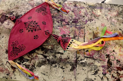
After research into cultural kites and festivals, I decided to base my kite on a Malaysian theme. I looked into Wau Bulan kites and Wau Merak. Wau Merak means peacock kite and this is why the kite has a bird like structure. The frame of this style of kite are made from bamboo and decorative patterns and designs are used to allow the kite to remain eye catching.
 To decorate my kite I firsty lightly tie dyed the fushia material, so that lighter patches would show over the wings of the kite. I then created stencils of various patterns using symmetrical designs and then painted these onto my fabric. I then also embroidered onto some on the paint work. The tassels on a Wau Merak kite are meant to be visible in the sky, and so to achieve this I decided to use a large colour range and dip dyed the ends of the tassels.
 This is my kite shown on a grafiti style background. The darker paints enable the tassels of the kite to show up really well.


A contrasting photograph against flowers.